


Imagine trying to access digital content, but the interface is so cluttered, confusing, or poorly designed that it’s nearly impossible to use. For many people with disabilities, this is an all-too-common experience. That’s where accessibility comes in.
But how exactly does one define accessibility in the context of digital design?
Designing for accessibility means ensuring that everyone can engage with and enjoy the digital world, regardless of their abilities. Just like a great party host, designers must create inclusive experiences that welcome everyone. By prioritizing accessibility, we can ensure that nobody is left out.
There’s a common myth that adding accessibility to the design process is expensive. Well, that, my friend, is just a myth. Incorporating it from the very beginning is cheaper, easier, and more effective than fixing it later as a separate project.
Bonus: Meeting accessibility standards will also indirectly help your SEO
Accessibility is not about a checklist, it’s about people.
The Curb-Cut Effect
The magical thing about designing for accessibility is that we’re not only helping the 16% of the population that have disabilities. We might, in fact, be helping everyone. Too ambitious? Maybe not. And we have the curb-cut effect to thank for that.
The curb-cut effect shows that when we design for disabilities, we make things better for everyone. The term comes from curb cuts (shocking, I know) — those small ramps added to sidewalks for wheelchairs. But they’ve also proved useful for people pushing strollers, travelers with suitcases, cyclists, and anyone with temporary mobility challenges.
It’s also worth remembering that disabilities can be contextual. A cracked phone screen or glare from sunlight on a laptop can affect accessibility, even for people without a permanent visual impairment.

Ok, cool. But where do I start?
In May 1999, the Web Content Accessibility Guidelines (WCAG) 1.0 were established. They set the international standards that still guide how we design for accessibility on the web. And when I say guidelines, I also mean legal requirements in some countries.
The WCAG established three conformance levels: A, AA and AAA.
Level A
Minimum compliance, providing text alternatives for non-text content, ensuring compatibility with assistive technologies, and enabling full keyboard navigation.
Level AA
Builds on Level A, adding requirements like a minimum contrast ratio of 4.5:1 between text and background, consistent navigation, and overall accessibility improvements.
Level AAA
The highest level includes Level A and AA plus additional requirements, such as a 7:1 contrast ratio, sign language interpretation for videos, and a ninth-grade reading level for content.
The recommended (and often legally required) standard is AA, which ensures content meets a solid level of inclusivity.
Now the fun part, let’s talk about designing for accessibility
Theory is great, right? Right?! But when it’s time to actually design, digging through the WCAG site can feel like a maze. So here’s a simpler starting point.
The WCAG created their content under four important principles: The user interface needs to be Perceivable, Operable, Understandable and Robust, ensuring everyone can interact with digital products, whether they have visual, physical, or neurodiverse conditions.
Let’s make that more tangible:
Perceivable
Content must be available to all users. If key information appears in an image, that information should also be accessible via an <alt> description. Context matters too, ever tried to watch a video in a quiet library? Captions make that possible.
Operable
Users should be able to navigate and use every feature via keyboard, not just a mouse. Try it on this post by using your tab key. Ideally, you won’t get stuck anywhere.
Understandable
Interfaces should behave predictably. Consistency in navigation and components helps users recognize patterns and feel comfortable moving through your site.
Robust
Code matters. A well-structured HTML with semantic tags ensures that assistive technologies can read and communicate content accurately.
Seems like a very straightforward starting point, doesn’t it?
Let’s dive into examples of best practices
Info and relationships
Preserve the integrity of information when changing between visual or auditory formats. For example, using larger, bold headers distinguishes them from body text, making hierarchy clear for everyone.
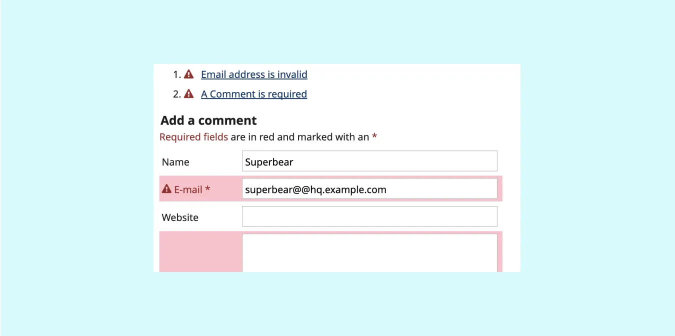
Error identification
When input errors can be detected automatically, highlight them clearly and provide a textual explanation, as demonstrated in the example below.
Focus order
Elements that receive focus should follow a logical, meaningful sequence during navigation.
Finally, some basic standards to keep in mind
The W3C also developed accessibility standards that help make digital experiences more inclusive. Here are a few to start with:
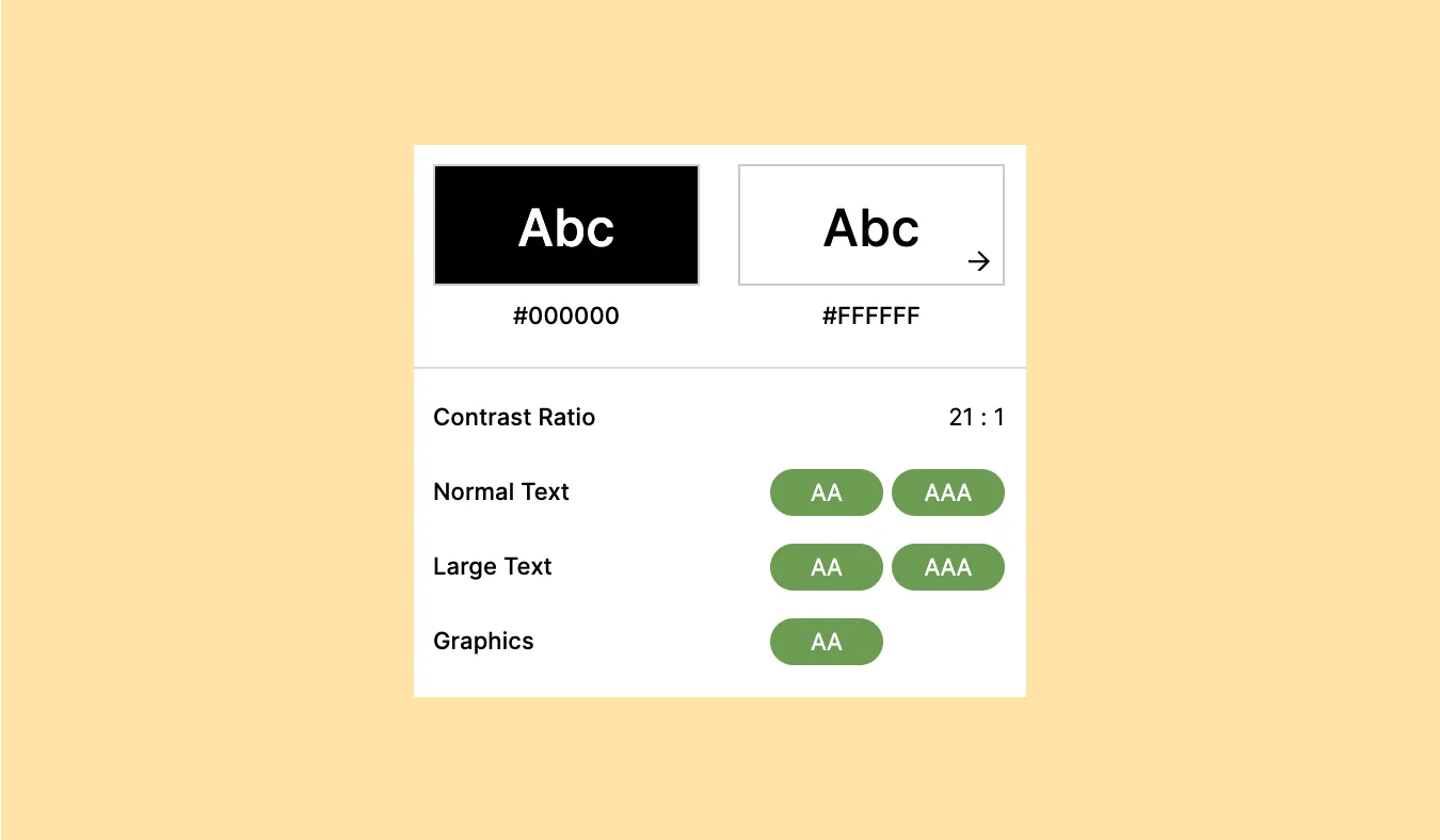
Color contrast
People with visual impairments may struggle to perceive low-contrast interfaces. Use high-contrast colors, clear visual cues, and descriptive text alternatives.
As illustrated in the example below, contrast is measured by comparing the luminance of a foreground and background color. For smaller text (below 24px), a minimum ratio of 4.5:1 is recommended; for larger text, 3:1 is acceptable.
Text size and zooming
Font sizes play a crucial role in web accessibility. To ensure optimal legibility, be aware of the font sizes you use.
- Use a recommended size of 16px for body text, depending on the target audience and device.
- Avoid default fonts smaller than 12px.
- Ensure users can zoom text up to 200% — flexible layouts help accommodate this.
Text spacing
Besides creating a clear visual structure with the help of headings, paragraphs, and lists, there are a few other essential details to consider when improving the readability of your content:
- Line height: Line height or line spacing (distance between baselines of text) is set to at least 1.5x the font size.
- Paragraphs spacing: Spacing following paragraphs is set at least 2x the font size.
- Letter spacing: Letter spacing or kerning (distance between two letters) is set at least 0.12x the font size.
- Word spacing: Word spacing or tracking (the space throughout the entire word) is set at least 0.16x the font size.
So, are you implementing accessibility throughout your design process?
As UX designers, we have the power to create inclusive experiences by integrating accessibility from the start, not as a quick fix later on.
Ready to embrace the power of accessibility? Let’s dive in together


